
Maximalist vs Minimalist Media Walls: Designing for the Interior You Have
When restraint is right, when richness is right, and the design principles that make either approach succeed in a UAE living room.
by Walora Design TeamUpdated 11 min read
The minimalism-versus-maximalism question lives at the intersection of personal taste and the room's actual demands. The right answer for any given apartment isn't a stylistic preference — it's an honest read of what the room can absorb.
What minimalism actually demands
A genuinely minimal media wall is one of the hardest things to design well. Every element has to earn its place; nothing decorative; nothing accidental.
In practice this means:
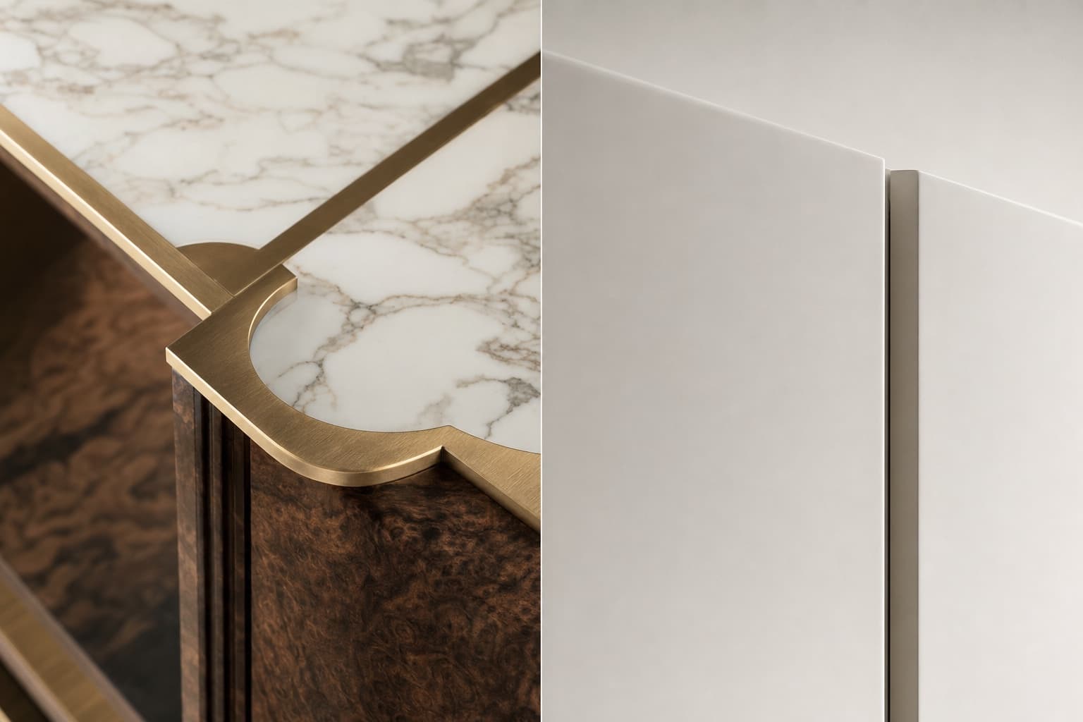
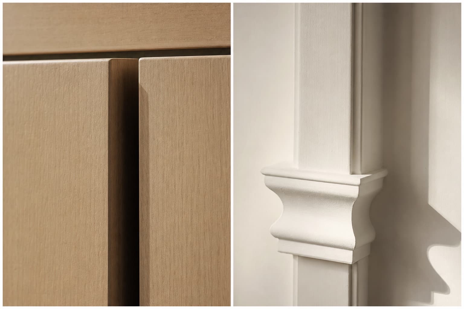
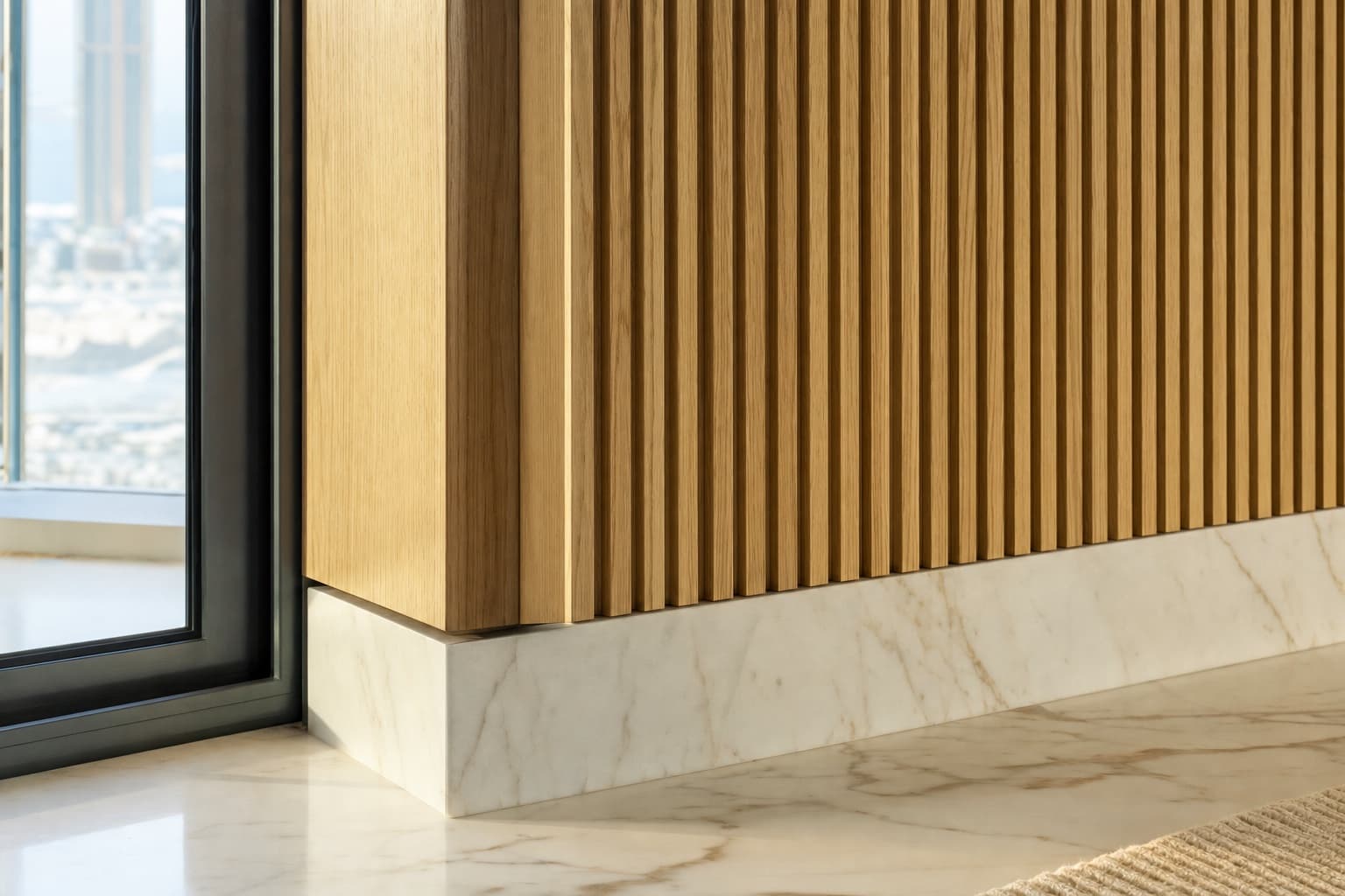
- A single material gesture — one large slab of stone, one bookmatched veneer panel, one continuous lacquered surface. Not three.
- Hidden hardware — push-to-open doors, integrated handles, no exposed hinges or pulls
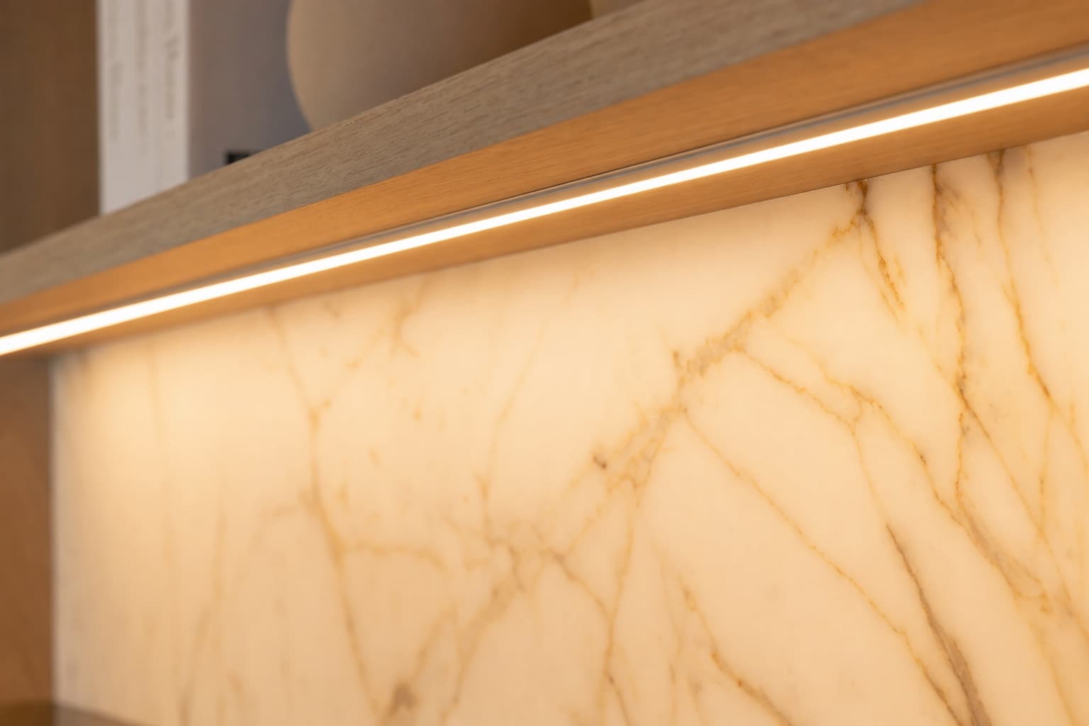
- Hidden electronics — TV concealed (art-mode or sliding panel), cables routed inside the wall, soundbar recessed or hidden
- Restrained lighting — concealed strip LED, no decorative fittings, soft warm wash
- No decorative trim — no mouldings, no contrasting edges, no decorative joinery
The wall reads as a single architectural plane with one or two strong material decisions. Photographs as one element rather than a composition.
Why this is hard: with fewer elements, every flaw is exposed. A 5mm misalignment in a wall full of features is invisible; the same misalignment on a single 2.5m slab against quiet ground stands out. The execution must be flawless because there's nothing for the eye to be distracted by.
 A material flat-lay contrasting a maximalist palette of figured walnut and brass with a minimalist palette of matte off-white lacquer.
What maximalism actually demands
The opposite extreme — a wall composed of many features, each rich in its own right.
In practice:
- Multiple material zones — stone feature panel, contrasting veneer cabinetry, lacquered alcove inserts, metal accents
- Layered lighting — strip LED behind shelves, picture lights, accent downlights, ambient cove
- Visible hardware — beautiful pulls, decorative hinges, considered metalwork
- Integrated features — fireplace, art display, sculpture niches, decorative shelving
- Compositional symmetry — elements arranged in deliberate balance left and right of the TV
The wall reads as a curated composition — a series of features assembled with intent rather than a single material gesture.
Why this is hard: every additional element is an opportunity for incoherence. Six well-chosen materials feel rich; the same six chosen badly feel chaotic. Maximalism succeeds through editorial discipline — knowing what to leave out — more than through addition.
What works in UAE apartments
A pattern across many premium UAE projects:
Most apartments aren't suited to either extreme. The architecture is contemporary but not severe; the buyer has nice furniture and some art; the room is used socially and casually. Strongly minimal walls look austere; strongly maximal walls look overcrowded.
The middle — restrained richness — works because it provides enough material interest to anchor the room without competing with the family's life happening in it.
A typical restrained-richness media wall:
- One real-stone feature panel (light marble, travertine, or quiet veined stone)
- Continuous quiet veneer (warm oak, ash) around the feature
- Minimal hardware (integrated edge pulls or push-to-open)
- Two lighting zones (cove behind TV/feature, strip wash on cabinets)
- One additional feature (fireplace, integrated display niche, or art shelf)
- Considered but not loud metal accents (brushed brass on hinges and pulls)
This describes 60–70 percent of premium UAE projects and is the safest premium answer for buyers without a strong stylistic preference.
When minimalism actively works
Three contexts where pushing toward minimal is the right call:
-
The apartment has dramatic architecture. Double-height ceilings, large windows, exposed concrete or stone elements. The architecture itself is the visual statement; the media wall should be quiet so as not to compete.
-
The buyer's personal style is genuinely minimal. Their other rooms are restrained, their furniture is curated, their art collection is small but considered. The media wall should match.
-
The room is small. Small UAE apartments (under 100m²) often benefit from minimal media walls because anything more makes the room feel crowded.
When maximalism actively works
Three contexts where pushing toward maximal is the right call:
-
Large villas with a dedicated family room or formal living room. Significant wall area can absorb multiple features without crowding.
-
The buyer's style is rich and traditional. Their other spaces are warm, layered, full of art and texture. A minimal wall would feel disconnected.
-
The wall is meant to be a statement piece. Some apartments are designed around the media wall as the room's hero; in this case, leaning into richness makes the wall earn that role.
The mistakes at each end
Minimal mistakes
- Too cold: Pure white walls in a sunny UAE apartment feel stark and unfinished
- No texture: A perfectly flat lacquered surface across the whole wall has no light behaviour; it dies under camera
- Empty without context: A minimal wall in an otherwise empty room reads as the room being unfinished, not deliberately minimal
- Cheap materials revealed: With nothing to look at except the materials, the materials had better be premium
Maximal mistakes
- Pattern fatigue: Multiple busy materials (heavily veined stone + heavily figured veneer + ornate hardware) compete and exhaust the eye
- No anchor: With everything competing for attention, nothing reads as the focal point
- Inconsistent quality: Premium veneer next to budget lacquered MDF mouldings breaks the illusion of overall richness
- Overstuffed proportions: Cramming features into a small wall makes a small apartment feel even smaller
The thread connecting both lists: lacking editorial decision-making. Both extremes fail when the designer hasn't worked out what the wall should look like and just defaults to either "remove everything" (minimal failure) or "add everything" (maximal failure).
Photographs vs lived experience
A wall that photographs well isn't always the same wall that lives well, and vice versa.
Minimal walls photograph dramatically — single material, strong lines, dramatic lighting on the feature. They can feel slightly austere to live with day-to-day, especially if the rest of the room is also restrained.
Maximal walls photograph richly in close-up but can feel busy in wide-room shots. Living with them is rewarding because there's always a detail to discover; the trade-off is that the room never feels like it disappears into the background.
Restrained richness photographs well at all distances and lives comfortably day-to-day. This is why it's the most common premium answer.
How to know which way to lean
A few questions that resolve the spectrum question:
-
What are the other strong features of your living room? If multiple — architecture, view, art — lean minimal. If few or none, lean richer.
-
How much do you change your interior? Frequently changing buyers benefit from quieter walls that don't lock in a strong direction. Permanent buyers can commit to richer expression.
-
Will you live with this for a decade? Bolder maximalist choices read as trendier in retrospect. If decade-plus stability matters, lean toward restrained.
-
What's your photograph instinct? Imagine the room in three years, photographing it for casual sharing. Do you want the wall to dominate, or do you want it as supporting context? Your gut answer is reliable.
The honest truth: most rooms are most successful with restrained richness. The desire to be definitively minimal or definitively maximal often comes from external influence (Instagram, design media, peer pressure) more than from what genuinely fits the buyer's life. The middle path isn't a compromise — it's typically the right answer.
What every premium wall has in common
Whatever the visual language, the underlying requirements are the same:
- Real materials at the right grade
- Proper construction and finish
- Considered hardware
- Quality lighting
- Workshop precision in execution
These aren't stylistic choices. They're the foundation of any wall that ages well, regardless of whether it's minimal, maximal, or somewhere in between. The visual language is the most personal decision; the underlying quality is the least negotiable.
Frequently asked questions
About the author
The Walora Design Team has been crafting custom media walls for UAE homes since 2024 — every piece built to order in our Dubai workshop from real natural stone, premium stained wood veneers and bin-matched LED.
Related reading
Design & Inspiration9 min read
Premium LED vs Cheap Strip Lighting: What Actually Matters
CRI, bin matching, dimmer compatibility, driver quality — the four things that separate cinematic media-wall lighting from the strip lights at a hardware store.
Design & Inspiration10 min read
Modern vs Classic Media Wall Styles: A Visual Comparison
Clean-line modern vs detailed classic interiors. How to choose which language fits the rest of your home, and the design moves that distinguish each.
Design & Inspiration10 min read
Where to Place a Media Wall in an Open-Plan Living Room
Open-plan apartments rarely have an obvious 'TV wall'. The four placement principles that decide whether the media wall anchors the room or fights it.